Kevin Wolfson pt.2
Last week we talked with Kevin from Firefly Bicycles about how their team came together to become one of the standout custom bike companies in the world. Now we are back with Kevin to get to story behind their stunning hand-painted fat bike.
Firefly mostly produces road bikes. Is it a unique challenge for you to make a titanium fat bike like this one?
Yeah, you’re right. We don’t do that many fat bikes or mountain bikes. We are totally capable of building both and we love to build them, but for the most part, people are looking for full-suspension mountain bikes and we just don’t build those. So, when you take the category of mountain bikers and then trim it down to the number of people who are looking to ride hard-tails, that helps to explain the small number of mountain bikes and fat bikes that we build.
We probably do one or two fat bikes a year and we’re totally comfortable doing them, but because we do so few, we always spend a little extra time making sure that we’re using the most current measurements and components because of how quickly fat bike standards have changed through the years.
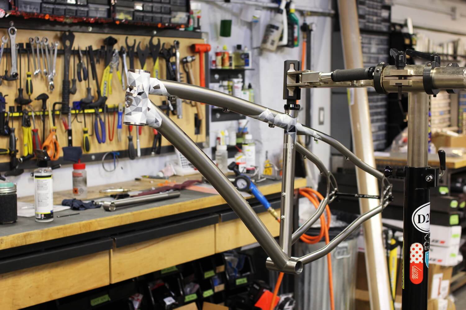
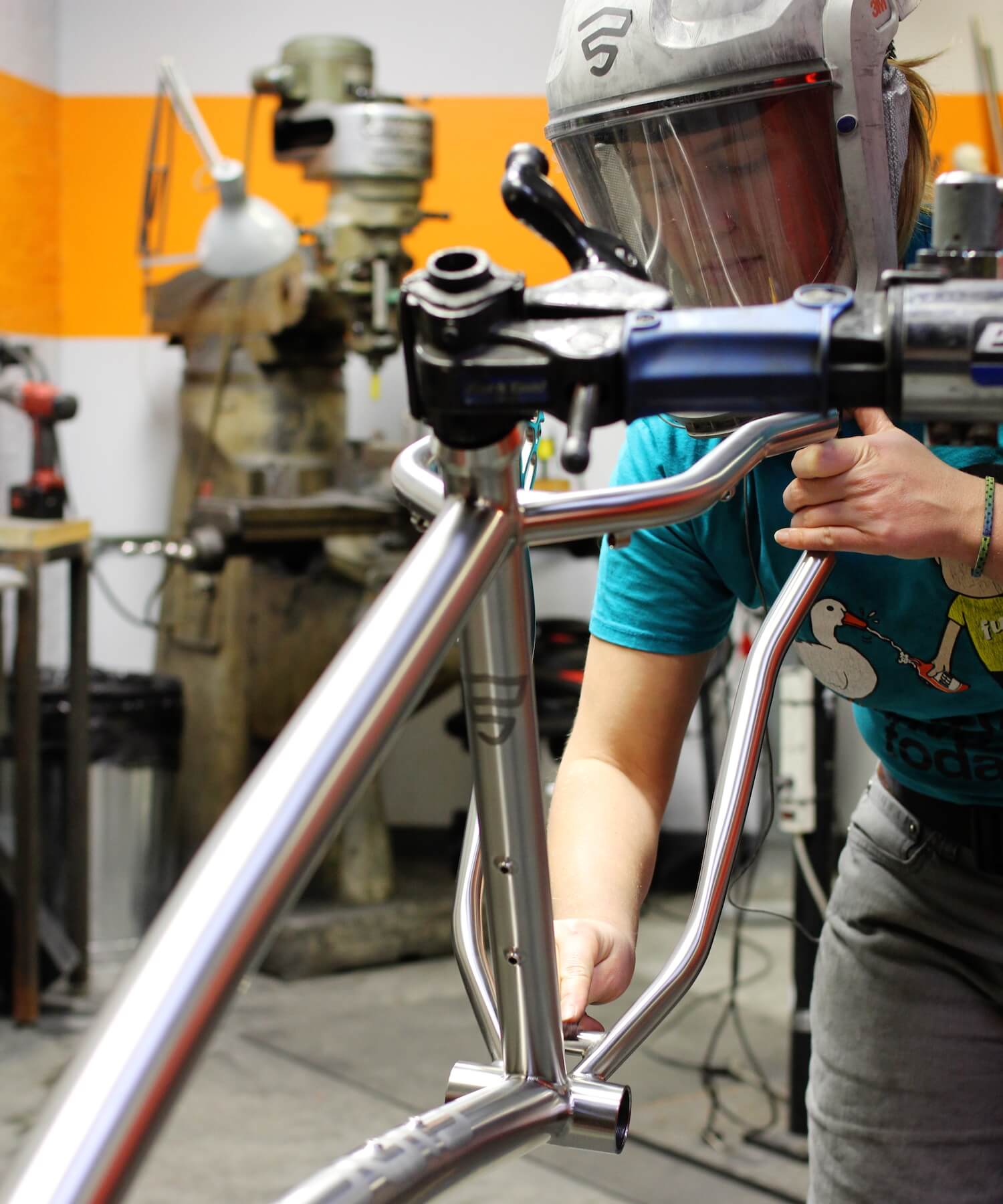
Another challenge was making a fat bike out of titanium. It’s difficult to bend titanium and make it stay in a certain shape. To achieve the clearances that you need for a fat bike it requires a lot of extra planning and the right tooling and expertise to get everything right. So, yeah that’s definitely a unique challenge when we get to build a bike like this.
How did you adjust the geometry of this bike to fit the rider?
We don’t approach frame design with any sort of set idea of what the geometry should be. It’s always about designing the geometry to work for the type of riding that each customer wants to do and for the terrain that they are riding on. That’s an element to designing off-road bike frames that that is particularly fun because the terrain that people ride on is so variable depending on their skill level, interests and where they live. You can do a lot to really customize the geometry of a bike for each person and to their region.
For this build the customer lives in Minnesota where there is a huge fat-bike culture. He is a more aggressive rider who likes to ride fast. So, he wanted a fast, light, quick-handling fat-bike. So, we designed it with a little bit more aggressive position than we might have otherwise. It doesn’t have a dropper seat post and overall has really light components to help make it faster.
Is that what lead you to choose the Whisky parts?
Yeah. Like I said, he wanted light and stiff wheels, so the Whisky carbon rims were a perfect choice both for their well-known quality and for how light they are. He also wanted a rigid fork, so that Whisky carbon fork was a great way to save a lot of weight compared to a fat bike with a suspension fork. Combining that with the No. 9 Riser Bar made it feel really quick and nimble.
We ended up building and setting up a couple of wheel sets so that he can really easily switch between tire traces by switching the wheels on the bike. There was one set with 26” studded tires and one with a wider, 27.5”, non-studded setup.
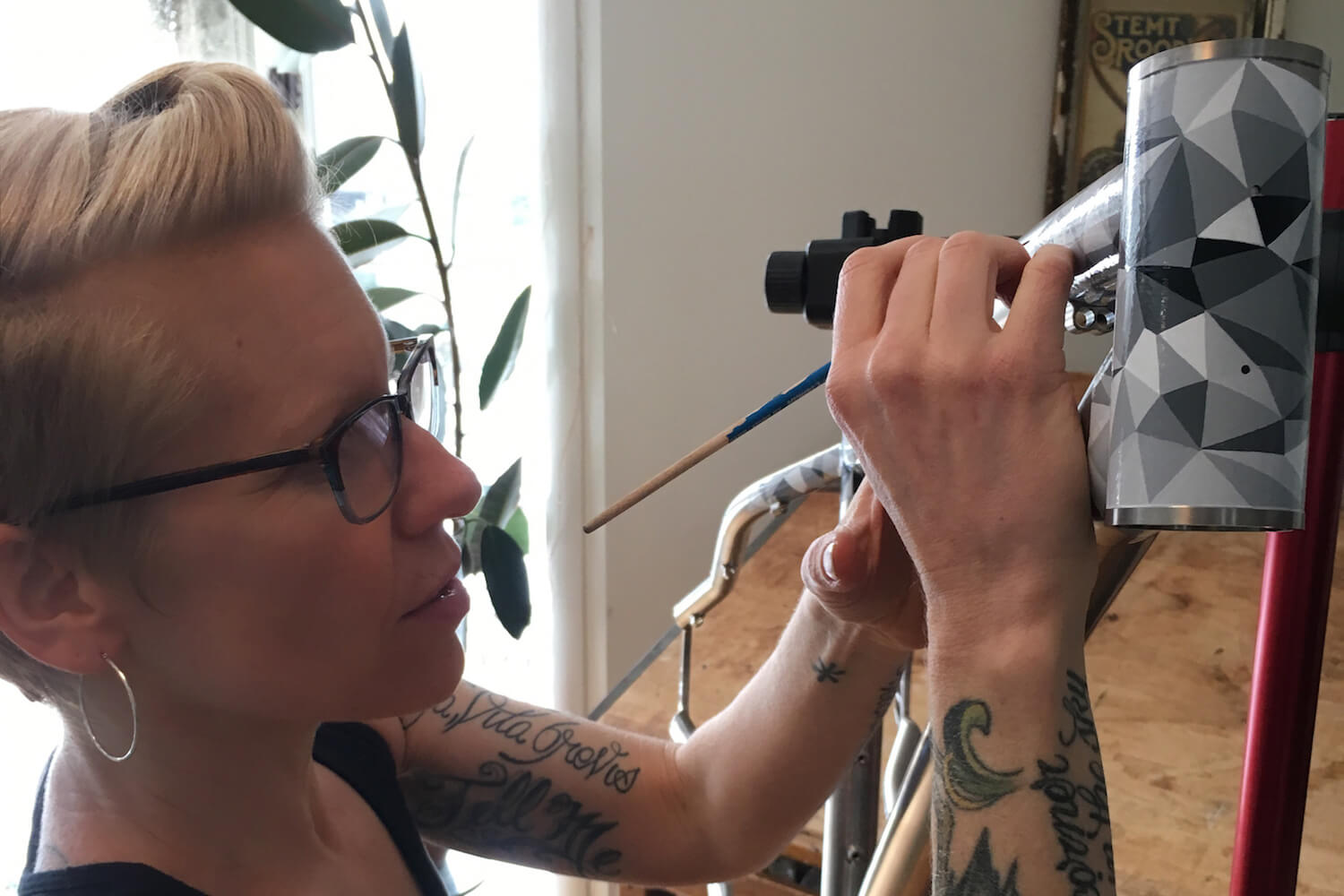
The most stunning feature of this build is the hand-painted design, which is pretty different from the anodized finishes that you are known for. Where did this idea come from and who did the work?
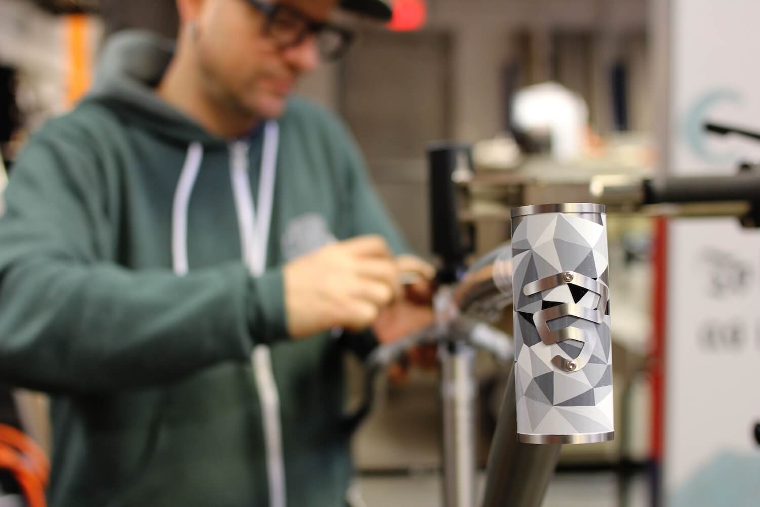
An artist named Josie Morway did that hand-painting. She has done one other bike for us before, where she took a customer’s concept and created a hand-painted design for it. This customer came to us with the idea to use drifting snow and ice crystals as a rough theme. He also mentioned that he really likes crystalized, angular structures. Josie has a huge skill set as a painter, but one of those skills is really incredible hand-drawn line work. So, her skill set fit really nicely with the concept. Josie used that to create a pattern idea, and then worked out the details of how actually to apply that pattern to the frame in a way that would match the customer’s vision. She also combined it really nicely with the look of the fame and fork to create a cool overall effect.
The small star details were always a part of the plan, even before Josie knew that the SRAM components were gold. That kind of small, contrasting metallic detail works really well with the titanium frame and the greyscale colors that she had chosen for the rest of the paint. She also uses gold in a lot of her artwork for that sort of detail and ornate line work. So again, it really tied in perfectly with her art style.
Were there any special take-aways from this project?
Every customer comes into the process from a slightly different perspective, with different ideas about geometry, finish or components. So, working with every new customer is a learning experience, and an opportunity to refine our process in a way that suits every individual. In this case the customer has a huge amount of riding experience and a really great style and visual taste. So, working with him to create a bike that matched both his riding style and needs, along with the aesthetics that he was aiming for was a really fun challenge. And because we don’t ask Josie to do hand-painted graphics like this too often it was even more interesting. We figured out how to incorporate a truly hand painted design scheme with a clean and consistent raw titanium finish to make something really special. And we couldn’t be happier with the results.
Thanks again to Kevin and whole team at Firefly Bicycles for allowing us to be a part of this beautiful piece of work. Click here if you missed part 1, and be sure to check back again soon for more incredible bikes.